There are some plug-ins that, in combination with Aurora, create a more harmonious interface as a whole. I only use two of the plug-ins, Aurora: Missing Textures and Aurora DBM. The missing textures just add the textures that were missing in the original add-on (duh), but it also skins the log-in page as well as the page with all your characters.
The Looks:
The log-in with authenicator.
Character log-in screen with add-on page.
In game character page.
In game Interface menu with the Esc menu.
Looking for group pages, both PvE and PvP.
Talent and Glyph pages.
Casting and Mirror bars.
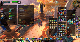
This screen shot has a bit of everything. I took off all my add-ons except for Aurora and this is the product. It's still messy and I hate clutter, hence I have tons of add-ons. Which, put together results in....
With Aurora, my Ui is cohesive while being aesthetically pleasing.


No comments:
Post a Comment