Monday, June 17, 2013

Add-on Highlight: Aurora

Aurora is a beautiful add-on that reskins the default WoW interface to a sleek, transparent black skin. I like this add-on because I hate the default interface, really hate. My meticulous, fussy mind wouldn't allow me to continue with out this add-on purely based on it's aesthetic value to me. I am very particular on how I like my  UI set up and I am annoyed when things are out of place or not looking minimal. This is one of the few add-ons that serve my "I want this to look pretty!" desire with out being functional to my play style. It does serve the purpose of making the Blizzard default screens pleasing to the eye and not giving me a headache for being opposite of the aesthetic i strive for in my UI.

There are some plug-ins that, in combination with Aurora, create a more harmonious interface as a whole. I only use two of the plug-ins, Aurora: Missing Textures and Aurora DBM. The missing textures just add the textures that were missing in the original add-on (duh), but it also skins the log-in page as well as the page with all your characters.

The Looks:
 
The log-in with authenicator. 

  
 Character log-in screen with add-on page. 

 In game character page. 

 In game Interface menu with the Esc menu.

 Looking for group pages, both PvE and PvP. 

Talent and Glyph pages.

 Casting and Mirror bars. 

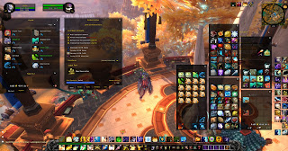
This screen shot has a bit of everything. I took off all my add-ons except for Aurora and this is the product. It's still messy and I hate clutter, hence I have tons of add-ons. Which, put together results in....
With Aurora, my Ui is cohesive while being aesthetically pleasing.  

Friday, June 7, 2013

Add-on Highlight: oUF and Mlight

oUF is a framework for unit frames. I love it because I can choose a layout that I like (mlight for example) and then I can play around with its configuration. 

I currently have oUF_Mlight for my layout. The reason I like this layout in particular is the raid frames. Out-of-the-box, the raid frames are great. They show the buffs you want showing in the healing format as well as an indicator of the raid buff that may be missing. I also love that it has a different configuration for tanks/dps and it switches automatically. 

Healing layout with hots.

Priest layout: top left corner is Renew, top right corner is Prayer of Mending, bottom left is time left on Power Word: Shield and the left middle is Weakened Soul debuff. I also added another dot next to the Weakened Soul indicator for Divine Aegis and another timer for Spirit Shell in the top left corner. 
Shaman layout: top left corner is for Riptide, top right for earth shield count.
Druid Layout: top left is Lifebloom, the color of the countdown reflects how many stacks is on the target (red=1, orange=2, green=3) top right is Regrowth, bottom left is Rejuvenation. I also added a dot in the left center for Wild Growth. 
Paladin layout: top left is Eternal Flame, top right is Beacon and left center dot is forbearance. 
Monk layout: top right is for Renewing Mist, left center is Soothing Mist, bottom left is for Zen Sphere, but my monk doesn't have that talent. 
All of the bottom right indicators are missing buffs, for example the druid, paladin and monk all have the same stat buff, and on all three it is missing, therefor it is the same color. 

This healing layout also shows big tank cool downs on a target, even if the buff was cast by another player. This icon shows up over the target's name on the right. On the left of the box, there is a debuff indicator icon. This icon prioritizes debuffs that can be dispelled (and can tell by class which type of debuff can be dispelled) it also shows major raid debuffs that are important to know. 

The way it switches from the healing layout to the damage/tank layout is genius. The healing layout is the normal raid frames that are important (and almost essential) for a healer. The damage/tank layout is much more simple and tucked away in the corner, to not be in the way. 
I pushed mine right under my mini-map on the top left of my screen. 
This layout only shows the player's name and health. 

On each of the raid frames there is an arrow indicator to show where a player is who is out of range.  There is also an option to have the frames transparent (like I have) or to have them have the class colors as the background. There are many configuration options in the in-game configuration menu,
and so many more options in the LUA file (with knowledge).

I love oUF for the pure simplicity that it gives the player while still being able to be configured to the player's liking, play style and aesthetic.


Tuesday, June 4, 2013

Weak Auras!

One of my favorite add-ons is Weak Auras. It's very versatile and very customize-able. I love that there is so much that can be done with this fabulous add-on. With my layout, I have a group of icons for my cool downs as well as a group of bars for spell times that need to be tracked. Basically, I took auras from Derevka's blog (found here) and modified them to fit and work with my UI. And I have he same general set up for all my toons:


Discipline Priest auras in action. 

Another fun addition I have made is a reminder for my buffs I need on me at all times, like Inner Fire/Inner Will for my priest or shields and weapons enchants for my shaman. 

This pops up if i have more than 1% health and I am missing either Inner Fire or Inner Will. 
Likewise for my Water Shield or Lightning Shield on my shaman, depending on what spec I'm in. 

I also have auras for my target that show up on the target's health frame (which didn't screenshot so well) which change depending on the target's class. I also have the same auras so up on my player health frame for the class I am currently playing. The one that photographed the best is the Paladin target with my Priest player aura:

And that' all I have for my Weak Auras! I love this add-on and I love playing with it. There are so many more textures and icons than I experienced with the Power Auras add-on. Weak Auras is an add-on I cannot play WoW with out. 

Weak Auras can be found here.


Monday, June 3, 2013

6.2.ui

So, there were problems with that last UI. Mainly, that I kept tunnel-visioning on my raid and I wasn't paying attention to my surroundings. When I did look off the raid frames, I lost our tank (which is really bad when you're tank healing). During our break on raid day, I had to change my layout really fast, so I did. Then after the raid I tweaked it more.

 In combat, in 5-man party. 
Out of combat, 10-man raid.

The raid frames were not in the center, so there was no way of watching my feet at the same time as my raid, which is important as a healer. My health is less important and is also reflected in my raid frames, so I don't need the player unit frame front and center.
In combat, 25-man raid.

This layout seems to work for me well. I can watch my raid while watching my feet and all the important information is right next to the raid frames, which have most of my attention.